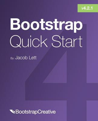
Bootstrap 4 Quick Start
-
9折 1103元
1225元
-
 預計最高可得金幣55點
?
可100%折抵
活動加倍另計 -
HAPPY GO享100累1點 4點抵1元 折抵無上限
-
分類:英文書>自然科普>電腦資訊>網路/網路安全追蹤? 追蹤分類後,您會在第一時間收到分類新品通知。
- 作者: Jacob D,Lett 追蹤 ? 追蹤作者後,您會在第一時間收到作者新書通知。
- 出版社: Bootstrap Creative 追蹤 ? 追蹤出版社後,您會在第一時間收到出版社新書通知。
- 出版日:2019/01/10
內容簡介
Want to improve the design of your website or web application without having to write CSS styles from scratch?
Updated to v4.2.1 January 2019
Learning web development is a lot more challenging than it used to be. Responsive web design adds more layers of complexity to design and develop websites. In this book you will become familiar with the new cards component, setting up the new flexbox grid layout, customizing the look and feel, how to follow the mobile-first development workflow, and more!
Web designer and developer Jacob Lett has built 100+ websites and WordPress themes. Let him show you exactly how to build responsive layouts that look great in every browser and device. He shares what you can't learn from the official documentation... the process of actually building a full web design layout.
This book is focused on the workflow and does not duplicate what you can already find in the official documentation. This book will show you how to reference the documentation and use it effectively in your projects.
BONUS: Includes a link to download a free cheat sheets bundle and a 1 hour training video.
Who is this for? You're a web development beginner and want to learn how to become a developer. You learned HTML5 & CSS3 but are new to responsive web design basics. You have used Bootstrap before but want to learn new techniques and workflow.
What will I learn? Learn what responsive web design is, the history behind it, and how the Bootstrap 4 frontend framework makes it easier to implement. Learn the web design process and how to build a website using Bootstrap 4. Learn what's new in Bootstrap 4 with a deep focus on CSS3 Flexbox, Cards, and the responsive grid layout.
What will I build? Responsive Marketing Homepage - Topics covered: responsive images, image cards, parallax background images, Google fonts, carousel cross-fade, and vertical centered text. Bootstrap Admin Dashboard - Topics covered: 100% height sidebar, card deck, FontAwesome icons, responsive charts and tables, and custom navigation tree menu.
How is this training unique? Learn by doing as you build two professional responsive layouts examples step-by-step. Focused on the workflow vs duplicating what you can find in the official documentation. This book will show you how to reference the documentation and use it effectively in your projects. Uses hyperlinks to point to code demos, snippets, videos, and external resources.
What do I need? Some experience with HTML coding and CSS is helpful but not necessary. Does not require knowing Sass, command line, or Photoshop. A computer with Google Chrome. A text editor like Atom and an internet connection.
You want to build a beautiful website or user interface that works on all major browsers. Let Jacob show you how step by step. If you like detailed step by step guides, plenty of examples, and printable cheat sheets, then you'll love Jacob Lett's approach at how he creates responsive layouts using Bootstrap 4.
Buy the Bootstrap 4 Quick Start today and start building responsive layouts in less time and with less effort!
配送方式
-
台灣
- 國內宅配:本島、離島
-
到店取貨:
不限金額免運費


-
海外
- 國際快遞:全球
-
港澳店取:


訂購/退換貨須知
加入金石堂 LINE 官方帳號『完成綁定』,隨時掌握出貨動態:
商品運送說明:
- 本公司所提供的產品配送區域範圍目前僅限台灣本島。注意!收件地址請勿為郵政信箱。
- 商品將由廠商透過貨運或是郵局寄送。消費者訂購之商品若無法送達,經電話或 E-mail無法聯繫逾三天者,本公司將取消該筆訂單,並且全額退款。
- 當廠商出貨後,您會收到E-mail出貨通知,您也可透過【訂單查詢】確認出貨情況。
- 產品顏色可能會因網頁呈現與拍攝關係產生色差,圖片僅供參考,商品依實際供貨樣式為準。
- 如果是大型商品(如:傢俱、床墊、家電、運動器材等)及需安裝商品,請依商品頁面說明為主。訂單完成收款確認後,出貨廠商將會和您聯繫確認相關配送等細節。
- 偏遠地區、樓層費及其它加價費用,皆由廠商於約定配送時一併告知,廠商將保留出貨與否的權利。
提醒您!!
金石堂及銀行均不會請您操作ATM! 如接獲電話要求您前往ATM提款機,請不要聽從指示,以免受騙上當!
退換貨須知:
**提醒您,鑑賞期不等於試用期,退回商品須為全新狀態**
-
依據「消費者保護法」第19條及行政院消費者保護處公告之「通訊交易解除權合理例外情事適用準則」,以下商品購買後,除商品本身有瑕疵外,將不提供7天的猶豫期:
- 易於腐敗、保存期限較短或解約時即將逾期。(如:生鮮食品)
- 依消費者要求所為之客製化給付。(客製化商品)
- 報紙、期刊或雜誌。(含MOOK、外文雜誌)
- 經消費者拆封之影音商品或電腦軟體。
- 非以有形媒介提供之數位內容或一經提供即為完成之線上服務,經消費者事先同意始提供。(如:電子書、電子雜誌、下載版軟體、虛擬商品…等)
- 已拆封之個人衛生用品。(如:內衣褲、刮鬍刀、除毛刀…等)
- 若非上列種類商品,均享有到貨7天的猶豫期(含例假日)。
- 辦理退換貨時,商品(組合商品恕無法接受單獨退貨)必須是您收到商品時的原始狀態(包含商品本體、配件、贈品、保證書、所有附隨資料文件及原廠內外包裝…等),請勿直接使用原廠包裝寄送,或於原廠包裝上黏貼紙張或書寫文字。
- 退回商品若無法回復原狀,將請您負擔回復原狀所需費用,嚴重時將影響您的退貨權益。


商品評價